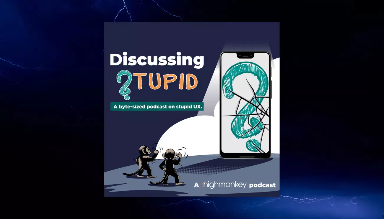
Discussing Stupid gets a fresh new look for Episode 11


At High Monkey, we believe in continuous improvement—whether it’s optimizing websites, refining digital experiences, or, in this case, reworking our own podcast’s brand and website to better reflect our vision. With Episode 11 of Discussing Stupid, we’re rolling out a brand refresh that makes our podcast branding more engaging, more polished, and frankly, easier on the eyes.
But the updates don’t stop there—we’ve also redesigned our podcast website, DiscussingStupid.com, to provide a better user experience for listeners.At High Monkey, we believe in continuous improvement—whether it’s optimizing websites, refining digital experiences, or, in this case, reworking our own podcast’s brand and website to better reflect our vision.
With Episode 11 of Discussing Stupid, we’re rolling out a brand refresh that makes our podcast branding more engaging, more polished, and frankly, easier on the eyes. But the updates don’t stop there—we’ve also redesigned our podcast website, www.discussingstupid.com, to provide a better user experience for listeners.
What's changed?
- A redesigned podcast website – We’ve overhauled www.discussingstupid.com to align more with our new branding, have a more simple layout, and provide a better experience for people browsing.
- A new color scheme – We moved away from the bright orange overload and busy background patterns. The new look is dominated by our dark blue and is much cleaner and easier to look at for extended periods of time.
- A refreshed intro sequence – If most of our YouTube viewers were dropping off during the intro, that was a sign we needed an update. We’ve restructured the intro to provide more value up front and let people know what they are getting into.
- Updated album cover & branding – The visuals across all Discussing Stupid platforms now feel more cohesive and modern, but more importantly they aren't bright orange with dots everywhere which should make our podcast and brand assets more seamless to engage with.
why we made the changes
After 10 episodes, we took a step back and evaluated what was workingand what wasn’t. While we were happy with the content, we realized our branding and website weren’t delivering the best possible experience for our audience.
- We needed a more inviting visual identity – The old branding leaned too heavily on bold, overpowering elements that weren’t as easy on the eyes.
- We wanted to improve the first impression – If people weren’t making it past the intro, we had to refine our pacing and presentation to keep people tuned in.
- We wanted a more visitor-friendly website – Our podcast site should make it easier to find and listen to episodes, explore past content, and connect with us.
What's next?
While Discussing Stupid has a fresh look and website, our mission remains the same: calling out bad digital practices and helping people do better.
With Episode 11, we’re kicking off this new direction by tackling one of the most common (and frustrating) mistakes in web design: why designs that look great in the design phase often encounter issues when being built for real-world use.
If you’ve ever struggled with making a design actually work across different devices, this episode is a must-listen.
🎧Check out Episode 11 and explore the new Discussing Stupid website today!
Here's the episode on our site. You can access the episodes across all major platforms from there: https://discussingstupid.com/episode/challenges-of-translating-design-into-responsive-build
Latest Blogs
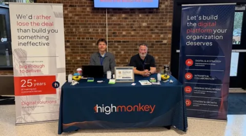
High Monkey at M365 Twin Cities 2026
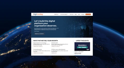
High Monkey launches a rebrand
.webp)
Inside the new OSA site
Your success story starts here
Contact us for a free consultation, and let’s work together to build a strategic plan that tackles your challenges and lifts your organization to a new level.