UIMN.ORG - Standing The Test of Time


In 2011, High Monkey was hired by the Unemployment Insurance (UI) division of the Minnesota Department of Employment and Economic Development (DEED) to re-design their existing UIMN.ORG website. As an informational website about unemployment insurance, it was about as interesting and exciting as most government websites could get (read: not at all). A core of our work approach was to insist on usability testing and basing the re-design on actual website visitor input. The UI team also floated the crazy idea of humanizing the new website with images of people. For the times and because, well, you know government . . . it was a radical approach.
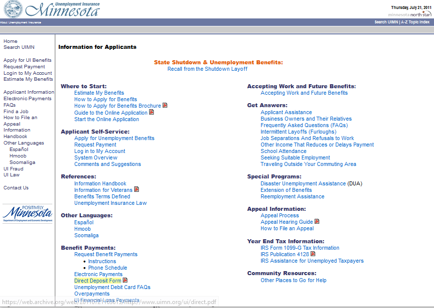
The UIMN.ORG website was, unfortunately, typical of most government websites from the first decade of the 2000s. It featured a gray and blue color scheme, unlimited text links, and almost no images. It was a user experience (UX) nightmare locked in time.
Imagine you’ve just been laid off from your job and need information about how to apply for unemployment benefits. Here’s the information page you would have found awaiting you.
So, what to do? Well, the key to escaping a UX nightmare is putting your users first.
We conducted user testing of the UIMN.ORG website and heard an earful. In one situation, we were able to get feedback from five people who had been laid off the previous day. Their responses were raw and charged with emotion. Another individual made a comment that stayed with us as guiding wisdom when she said, “I just want to know if I’ll be okay.”
How do you design a website for that?
The first thing we did was share UX testing results, user feedback, and video clips of people trying to find information they needed during our user testing. If there were any doubters among the unemployment insurance team, they were now convinced that DEED and the UI Division needed to be thoughtfully customer focused.
Next, we worked up information architecture and prototype designs that would help people find the information they needed with ease, and we livened the site up with images to enhance the overall visual experience. . The information was now organized in a way that helped people succeed in finding what they needed. While we could not guarantee that people would ‘be okay’, we could help them confidently move forward.
When the UIMN.ORG website was re-launched in the Spring of 2012, it looked distinctly different and stood out compared to other State of Minnesota websites.

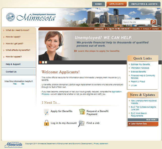
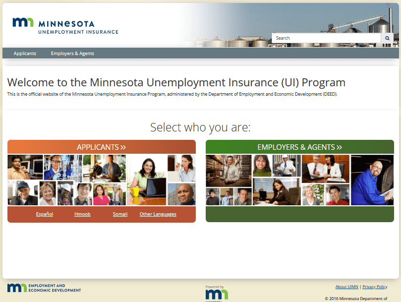
It may seem a bit obvious now to have ‘Select who you are:’ as the focus of the home page, but in 2012, this was a somewhat (r)evolutionary idea. Also, the UIMN.ORG website now featured human faces, colors, and photos.
The ‘Applicants’ page was designed to be equal parts human friendly, easy to use, and well organized.
We conducted user testing of the new design, navigation, images, and messaging and had resoundingly positive results to share with the unemployment insurance team. Turns out, putting the users first makes your website easier to use!
Has the UIMN.ORG website withstood the test of time? Has it aged well?
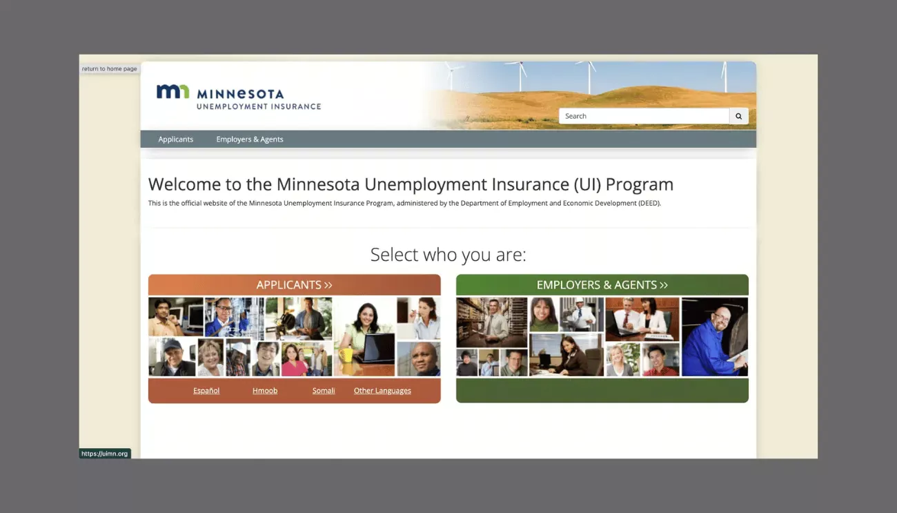
Here’s the website in 2022.
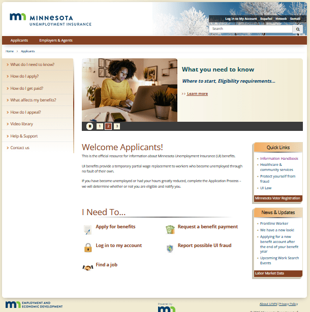
The UIMN.ORG website continues to serve DEED and the Unemployment Insurance Division more than 10 years after its re-launch. Will it look similar in 10 more years? We hope so.
Our closing comment: 'Nailed it!'
Latest Blogs
MindLab Connect Is Live


Can a marketer replace a developer with AI coding tools?
Discussing Stupid Season 3: 1,000 Listeners and Counting