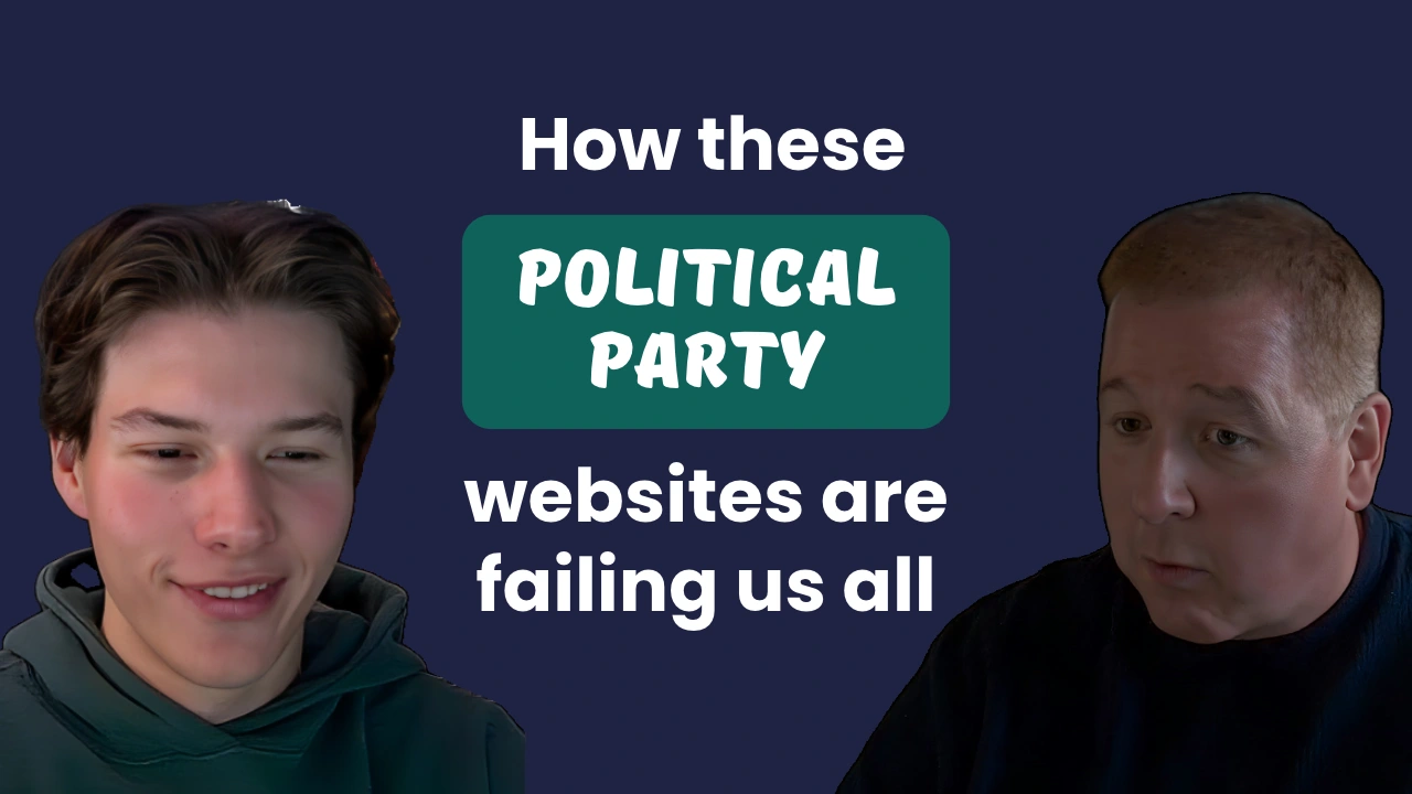
How these political party websites are failing us all


Show Notes
It’s Election Day, and every party is asking for your vote. So we checked whether their websites let everyone in. Virgil and Cole reviewed the national DNC, RNC and Green Party websites for accessibility and usability, and did their best to leave the politics out of it.
The idea behind the episode is simple. A party that wants every vote should have a website that every voter can use, whether they’re on a phone, using a screen reader, or just trying to find out what the party stands for. None of the three gets a clean bill of health. Each one falls short in its own way, whether that’s a site that mostly follows the rules but still gets in your way, a site built to push you toward one action, or a site nobody seems to have looked after in years.
What the sites prioritize says a lot. These are organizations with real budgets, and their websites work more like donation funnels than introductions. The ask for money is front and center, while the information about who they are and what they believe is harder to find, and harder for some people to use at all.
Virgil also wonders how much of this comes from organizations working in a constant scramble, pushing changes live in a hurry with nobody checking what they break. That isn’t unique to politics. Plenty of organizations run their websites the same way.
Virgil and Cole also disagree on whether a smaller budget excuses an inaccessible site, and Virgil makes the case that free tools leave little room for excuses. They close with the first thing they’d fix on each site, and most of the fixes come down to basic attention to detail.
(0:00) - Intro
(1:45) - Today's topic: Political websites, critiqued
(3:30) - Built for donations, not voters
(4:52) - The pop-ups you hit first
(6:04) - How the three sites scored
(7:22) - Why big-budget sites still fail
(11:13) - The worst offense on each site
(13:16) - Should the Green Party get a pass?
(15:10) - None of these sites are innocent
(18:18) - What we would fix on each site
(21:52) - Closing thoughts
Subscribe for email updates on our website:
https://www.discussingstupid.com/
Watch us on YouTube:
https://www.youtube.com/@discussingstupid
Listen on Apple Podcasts, Spotify, or Soundcloud:
https://open.spotify.com/show/0c47grVFmXk1cco63QioHp?si=87dbb37a4ca441c0
https://soundcloud.com/discussing-stupid
Check Us Out on Socials:
https://www.linkedin.com/company/discussing-stupid
https://www.instagram.com/discussingstupid/
Transcript
VIRGIL 0:00
Okay, so sometimes, every once in a while, we've got to do a little tongue-in-cheek episode. And we thought this would be a fun one, considering that this launches on Election Day and everything's been about elections. We thought instead of us picking on the elections, we would pick on some sites for political parties, and what we like and don't like, and all the violations we have. If this kind of topic interests you, or even if you just want to hear a lot of funny things, join us as we start discussing stupid.
COLE 0:40
Discussing Stupid is brought to you by High Monkey, a digital consulting company. We talk about this stuff because we've lived it. We help organizations all over the world deal with their stupid. Find us at highmonkey.com.
VIRGIL 0:54
Well, hi, everybody. Welcome back to the podcast. We kind of decided last minute to do a little different episode this time, because this episode happens to be launching on Election Day. Exactly. Now, to put a caveat, we're not going to get real political here. We're not interested. We're done with our voting. We're done. We're past it and all that. And you're probably like, God, I don't want to hear about it anymore. But the one thing we do love to do, not a political thing, is make fun of websites. And so we thought, after seeing all this stuff that's been put out there, from videos to new websites for all the different candidates out there and all the different places out there, that we would pick on some sites.
COLE 1:46
In theory, if a party wants your votes, everyone should be able to use the party's website well, right? It should be a very usable site for the whole world to use.
VIRGIL 2:01
Yeah, right. Exactly. Should be usable, we'll say. So, Cole, what sites did we decide to look at?
COLE 2:12
Yeah, so we kind of stuck to the basics here. We looked at the DNC site, the Democratic Party site, and we looked at the RNC site, the Republican Party's, and we also looked at the GP, the Green Party site.
VIRGIL 2:30
Green Party site.
COLE 2:31
Yeah, just kind of threw another one in there.
VIRGIL 2:34
And so this episode kind of comes because, quite a few years ago, I spoke at the Minnesota IT Symposium, which used to be a symposium for government agencies around the state of Minnesota. And during my very first presentation, I did something around governance and user experience in government websites. And I thought about picking on Minnesota sites because I was in Minnesota, and I said, well, maybe I shouldn't do that. So I picked on Wisconsin sites instead. And then, of course, all the questions I got were around Minnesota sites. So we decided not to pick on any one party candidate's site, but instead pick on the big guys, because nobody cares about them in the first place, right?
COLE 3:18
Yeah, you know.
VIRGIL 3:19
Anyway, so let's just kind of get into it and say that most of them kind of suck.
COLE 3:30
Yeah. I mean, well, my major takeaway across the three is that I can't honestly say, after browsing them, that their main goal was to genuinely convince me to be a member of their party. I don't know. The intent felt more like, you know, for me to donate, and potentially to even deceive me. I just, you know, it seemed like the goal...
VIRGIL 4:01
Yep. One of the things I loved about it is, literally, this is episode three, and before this we talked about the WCAG 2.2s, which all these sites violate. Actually, it's the only thing that the Green Party site did better than the other two, was that it didn't violate the new 2.2 ones. And then our next episode after this one is about pop-ups and everything and trying to capture eyeballs, and these sites just go nuts about that and everything bad about it. So this is literally the perfect segue between those two episodes, because right there, you get to the DNC, you get to the RNC site, the first thing you do is get a big-ass pop-up in front of you. But they did them a little different.
COLE 4:52
The RNC one is literally just an image. It's like, oh my God. Like, okay, it says... I think it's a rotating pop-up. It says a different thing each time, I'm pretty sure.
VIRGIL 5:08
And it gives two buttons that aren't buttons. Yes or no.
COLE 5:11
No, no, it's one link. The whole image is a link that goes to the donation page.
VIRGIL 5:16
Oh, man.
COLE 5:17
I mean, come on. At least they actually have a real X at the top that'll let you exit it. But it's just so funny having a yes or no. And there's no alt text on it.
VIRGIL 5:28
Yeah. Well, and the DNC at least does better than that. But then on the same side, every single fricking page on that site has a big-ass banner at the top that's trying to promote something.
COLE 5:40
Yep. And also, on the DNC site, that banner is an H2, and it throws off the heading order. So that's another...
VIRGIL 5:50
Yep, that's everything.
COLE 5:51
Yeah. So just, where do accessibility standards go when it's the literal party's head website? Like, I don't, I don't get it. Do you?
VIRGIL 6:04
Well, and I want to say this just for everybody up front. So we tested the three sites for accessibility, and we also did some usability observations. Accessibility-wise, the DNC site is absolutely the best. It still has violations, like you just mentioned, the H2 before the H1. That's a violation, and that kind of stuff. But overall, comparatively, it passed almost every category that we tested. The RNC's site failed quite a few areas. Some of them were really big, some of them were not so much. They don't have very well-structured pages. A lot of their links go to other sites and it doesn't say it. There's a lot of things like that, and we'll dig into those a little bit more. The Green Party site is ridonkulously terrible. And as another party, I know it's not considered a major party, but a minority party, it failed almost everything. I laughed at, like, they have five H1s on their homepage, and almost all their pages have the same name. The name of their homepage is www.gp.org. That's the name of the homepage. There's nothing else in that. I mean, they're just terrible.
Anyway, you know, part of what I kind of went through when I saw how many violations these orgs have is I wonder just how much they are reacting. And I mean, we have customers that react. They've got to put something up really quick because of some type of issue or some type of marketing message that's going out. Everybody's always in a panic. Well, you've got to imagine, especially during election season, as you're getting closer, and we did these tests, what, about a month before the election. So you've got to figure that right now they're in scramble mode. But the ironic thing that I found kind of interesting is the Green Party and the DNC had a lot of information on their sites, where the RNC site had very little information actually on the site, and almost everything, they visited another site for that. And there was no indication, yet they seem like major navigational items, which I just thought was terrible. And it's also an accessibility violation, because they're not letting anybody know that you're actually going to a new site.
COLE 8:27
Which again is ironic, because wouldn't you want everyone to be able to successfully browse your site if you want to convert them as a voter or get money from them? But I don't know. And now I think I see what you're talking about a bit more when you said it was going to be hard to not get political on this.
VIRGIL 8:44
Yeah, yeah, it's hard not to. I mean, it's hard not to pick on the different political platforms. But overall, from the standpoint of it, the people managing these sites should be good web professionals. I mean, unless they're getting somebody with just business experience doing this. I mean, you've got to imagine, these are not... Okay, maybe I don't totally understand the budget of the Green Party, but when you talk about the DNC and the RNC, you're not talking about organizations with small little budgets. I mean, I can kind of forgive some of the local candidates, because some of them are working on just a shoestring budget. You know, somebody running for city council or even that. But for the millions and billions of dollars that are being spent on advertising, you would think, well, we want to get everybody to vote, so we would kind of look at it and say, well, maybe we should hit these. And I mean, from that right there, they all failed in my mind, because they obviously didn't think that inclusive design was the most important part of their platform.
COLE 9:57
Yeah, it lets you know where the priorities are. But at the end of the day, in an ideal world, these sites would give you an immersive experience of where all their values are, and be very content up front, and really give everyone a good idea of what they stand for. And then, hey, if you feel like our messaging was good enough, then by all means, we'd appreciate a donation. No, it's just donate. Wait, sorry, that wasn't the camera. Donate.
VIRGIL 10:27
Donate. Yeah, yeah. No, I agree. I mean, obviously that's what they all want. They want you to donate to their parties, they want to use it for their political ads, and they probably don't see their websites as their big main feeders. But the irony is that most of these are promoting, especially in this midterm election, the national elections, where people are getting into the national. And where do the standards come from that we're supposed to be compliant with? Nationally. And if you want every person in the U.S. to visit your site and get information from it, not only from an accessibility but also from a usability standpoint, wouldn't that be an important thing? I mean, to make sure it's easy to use.
I mean, I can pick on each of them, but I'll say some of the most egregious errors I saw on the DNC site is that every time you visit a new page, that banner comes up. No matter how many times you X out of it, it comes up every time, which pushes the entire navigation down. Even on my big screen, it almost pushes it down to where it's not viewable, which is just ridiculous. Once you close it, you shouldn't see it again. And a lot of their stuff, I'm going to admit, a lot of the naming of their pages didn't totally make sense, for, yeah, the media area and that kind of stuff. But the RNC one, they use a fricking hamburger menu for desktop, and that is one of the most irritating things from a user perspective. And their main things all go to other sites. So literally, on their homepage, they have a video there, and then they have a couple links to other sites, but they have nothing on their homepage, nothing about who they are, what they're about, anything. It seems very driven by the agenda of one person. I mean, you know, from there.
COLE 12:25
I was going to say, they don't really need to put a ton of information on there.
VIRGIL 12:29
Right. I suppose. The Green Party, on the other hand, is every speaking session I've ever given. From a user perspective, the Green Party violated it. I mean, they have, what, 15 navigation items with dropdowns on multiple levels. They have like 70 links inside their pages, all going to different things. Most of them don't have the correct information on them. They have a big rotator that you can't stop. I mean, honestly, I could pick on that site forever, because it's absolutely horrific how bad it is.
COLE 13:06
Oh, don't get me started on the Green Party. I mean, obviously no offense to the Green Party. I'm just saying, like, I mean, how many...
VIRGIL 13:16
I'm going to disagree with you. I'm going to say offense to the Green Party, because they should care.
COLE 13:21
Okay, okay. Fine, fine.
VIRGIL 13:23
They should care. Even if they don't have a budget, they can run one of 15 different free tools to figure that out and get somebody who knows what they're doing. I'm sorry, I just don't let them off the hook like you do.
COLE 13:38
Yeah, I'm definitely kind of giving them some slack here. But I mean, wow, the amount of images on their homepage that are cut off. There's important text on the images, and it's just cut off in the middle. And I mean...
VIRGIL 13:56
Yeah. Well, how about how long their homepage is? It's like forever. They have sliders, and they have pillars, and they have news, and it's just so busy too. It's like crazy.
COLE 14:10
Yeah. But the biggest thing I would say that's insane is the color, their primary brand color, and how inaccessible it is with all the backgrounds. And you can't even use the font size argument on it, because the link text is that, and it's like "Continue reading." You can barely even see that. And so, I mean, I will say one thing. Their buttons are probably the best out of all the websites. They're probably the biggest, I would say, on that site.
VIRGIL 14:47
And, you know, maybe not putting a lot of money into your website saves the environment somehow, but I'm pretty sure making it inaccessible is not an environmental safety type of thing.
COLE 14:58
No, definitely not.
VIRGIL 15:00
So, sorry. We promised we're not going to get political, but we had to do it.
COLE 15:05
Wow, we've been trashing the Green Party site for a good portion of the episode so far.
VIRGIL 15:10
Yeah. I mean, well, that's the thing. The other two kind of get really interesting. But I think, overall, they just have different things that they do well and different things that they don't. I mean, if we were to say the next bigger violator, it's the RNC site. I mean, it has so many usability issues. Their pages aren't structured correctly. They're using a lot of headers out of place. They're doing a lot of things like that. They have a lot of links that have no alt tags. It just feels like somebody didn't put time into actually making this. And I know some people listening are probably like, well, they don't care. And I say, I don't know that I agree with that, because some of this stuff is done. So again, I really wonder. It'd almost be interesting to go back to the Wayback Machine and see what it looked like a couple of months ago versus now, and how much they've changed it, and if they're just kind of reacting and responding to different things and changing it so frequently that they're just running out. I mean, hamburger menu, unexcusable to me. Header structure, unexcusable to me. Some of the other things are things that I see on a lot of sites and that kind of stuff. But not having alt tags is just unexcusable to me. I just can't understand that in today's world. It's such an easy check. It's such an easy update. There's just so many different things that happen there. But of course, we could continue it.
But let's not forget the DNC site. I mean, they have a lot of header issues. They do a lot of things. They're opening up a lot of tabs without warning, which is a big thing now in accessibility, making sure that people understand that a link's going to be opened up in a new tab. And especially from a WCAG 2.2 level, a lot of their buttons on mobile are way too small, for the fat finger syndrome that we talked about in the WCAG 2.2 episodes, and that we'll talk about again probably in the next episode after this one. And a lot of their forms don't have good focus. There's a lot of things. So none of these sites are innocent.
COLE 17:30
No, definitely not.
VIRGIL 17:32
Which, if there's ever a political commentary, that probably is right there. None of these sites, none of these orgs, are innocent.
COLE 17:39
Well, it lets you know across the board what the function of the site is. And I feel like I've said this like five times this episode, but yeah, they're essentially just donation funnels. But they're not very... I don't know. I wonder how much they actually rake in from these sites.
VIRGIL 18:02
You know, I thought I saw something about how the national parties aren't raking in as much as the individual candidate sites these days, but I don't know if that's true. I just remember seeing it on the news, so we'll take that for what it's worth.
COLE 18:17
Makes sense.
VIRGIL 18:18
But I think where we can kind of wrap this up is, let's talk about it. If we were looking at these sites, what are some things that we would do differently? And so, what are some things that you would probably do differently on the DNC site?
COLE 18:34
DNC site. The first thing I would do is definitely, with that banner at the top, I would shrink that down, and I would ensure that the heading structure across the board is compliant. And then, those are my two biggest things for the DNC site. How about you for that one?
VIRGIL 18:56
Well, I think that they need some work on their submenus, making sure that they're kind of bigger and fitting into what they need in there. And I think the other thing that I kind of look at is that they really need to work on the tabbing structure of their site. It seems to have some deficits there, especially with their pop-ups and their banners. It seems like those things were thrown on there. Overall, their site does pretty well. So how about the RNC site? What are some things that you would do there?
COLE 19:28
I think I would add content. I would add a huge, you know... Yeah, I would add content. No, okay, in all seriousness, the pop-up, it's embarrassing, you know? They should probably figure that out. Add some real buttons there, and maybe take it to different pages if you click on yes or no, instead of just going to a donation page from clicking on the image itself. And alt text.
VIRGIL 20:00
Well, one of the big things is, I noticed this, and I don't know that I've seen this in quite some time on a site, but they actually have, in the meta viewport, user-scalable equals no, which basically means it won't allow somebody to increase the size of the page with the magnifier, which a lot of times is people with vision issues and that kind of stuff. And my assumption is they did that because they didn't want to spend the time doing that. So that's definitely a big one. The other thing is that they have so many alt tags missing. They have so many links that don't make any sense. They have so many things. There's really a lot to do. And I'm going to simplify the...
COLE 20:42
Don't they have autofill turned off too?
VIRGIL 20:45
They do. They have autofill turned off on their forms, which is such a thing. And that was probably so that they didn't have to run a CAPTCHA or something like that. They wanted to do that, so they just said autofill can't happen, which is a huge accessibility violation. And the Green Party, I'm going to make this one simple. Delete. Start over. That's what they need to do. They really need to start over from scratch.
COLE 21:09
I mean, this is a site that, I think in general, has been... I think it's probably the oldest. It's been sitting around for a while.
VIRGIL 21:19
It looks like it. And I know the Green Party maybe doesn't necessarily have the cachet that it used to quite a few years ago. But at the minimum, they need to fix their navigation desperately. They could definitely clean up. They need to make their colors compliant. They need to work on their heading structures, all that kind of stuff. So there's all things these groups can do to get better. Again, not being political, but there's probably everything that they could do to be better and do things to serve more of the general public than what they currently do.
COLE 21:49
Certainly. That's what we're all about.
VIRGIL 21:52
Yeah. Well, we hope you enjoyed this episode. We thought it'd be kind of a fun, kitschy thing since we saw this was going to launch on Election Day. Obviously, by the time maybe you read this, elections are over, and now we just have our two-year reset to the next one. And hopefully these orgs will listen to this and actually start doing and discussing stupid on their own.
VIRGIL 22:17
If you enjoyed today's episode, you can access more by visiting us on the web at discussingstupid.com. You can also find us on LinkedIn, YouTube, and TikTok, and all the other major social platforms. Discussing Stupid is proudly produced and owned by High Monkey.
Latest Episodes
How these political party websites are failing us all
The new WCAG 2.2 rules you're already breaking (part 2)

The new WCAG 2.2 rules you're already breaking (part 1)
Sign up for Discussing Stupid updates
Get the latest Discussing Stupid episodes, expert insights, and exclusive content- straight to your inbox