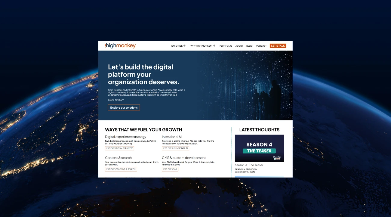
High Monkey launches a rebrand


High Monkey just underwent a rebrand!
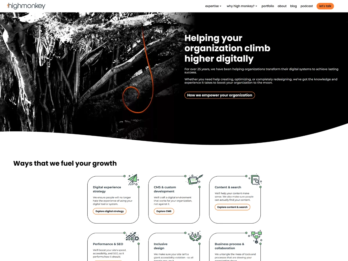
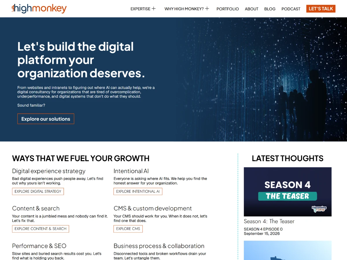
We have a redesigned logo, a new color palette, and a completely refreshed design on our website.
We're in the middle of a real shift as a company, and we wanted our branding to actually say so instead of quietly changing around everyone. It's not just new colors or a new layout. It's a signal: we're evolving, and we want to help you do the same, whether that means making sense of AI or making sure your organization's digital platform grows with you instead of holding you back.
Here is what changed, and why.
The logo
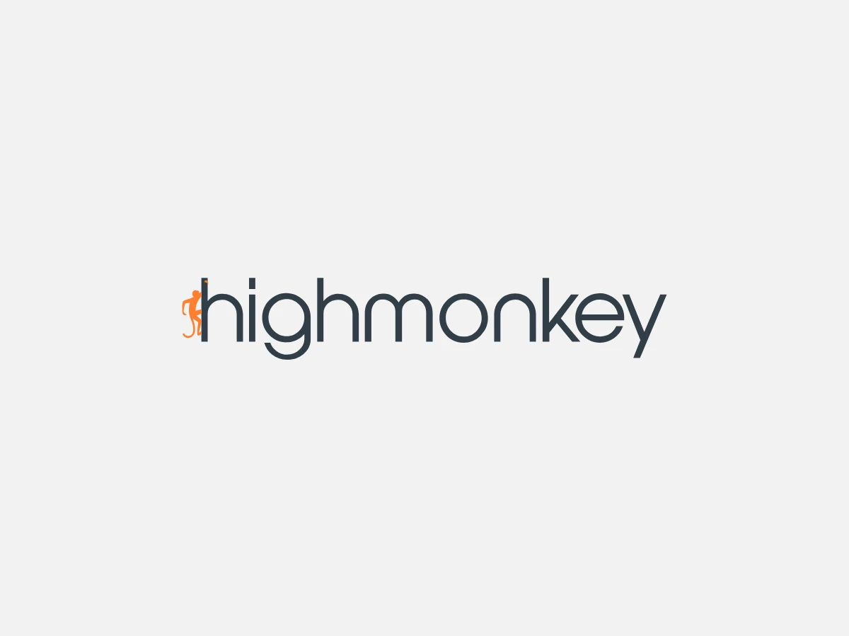
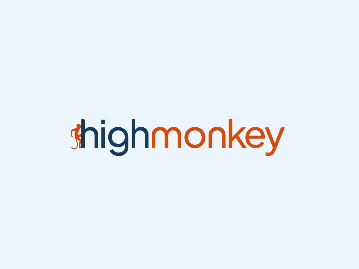
The letters are thicker, they took on a new shape and form, and the whole wordmark sits with more weight than it used to. The biggest change though is the changeup of color. Our logo is now two-tone, navy for "high" and orange for "monkey," with the monkey mark still climbing the h.
That split is deliberate: we're High Monkey, two words, not one compound "Highmonkey," and the color break finally makes that visible. We have several approved variations for different backgrounds, but the dual-color version is the primary, and we love it. It also sets the tone for everything else, because those two colors became the foundation of the palette that came next.
The color palette
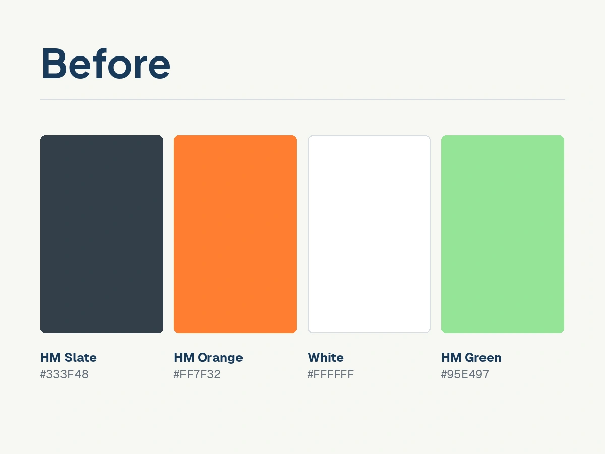
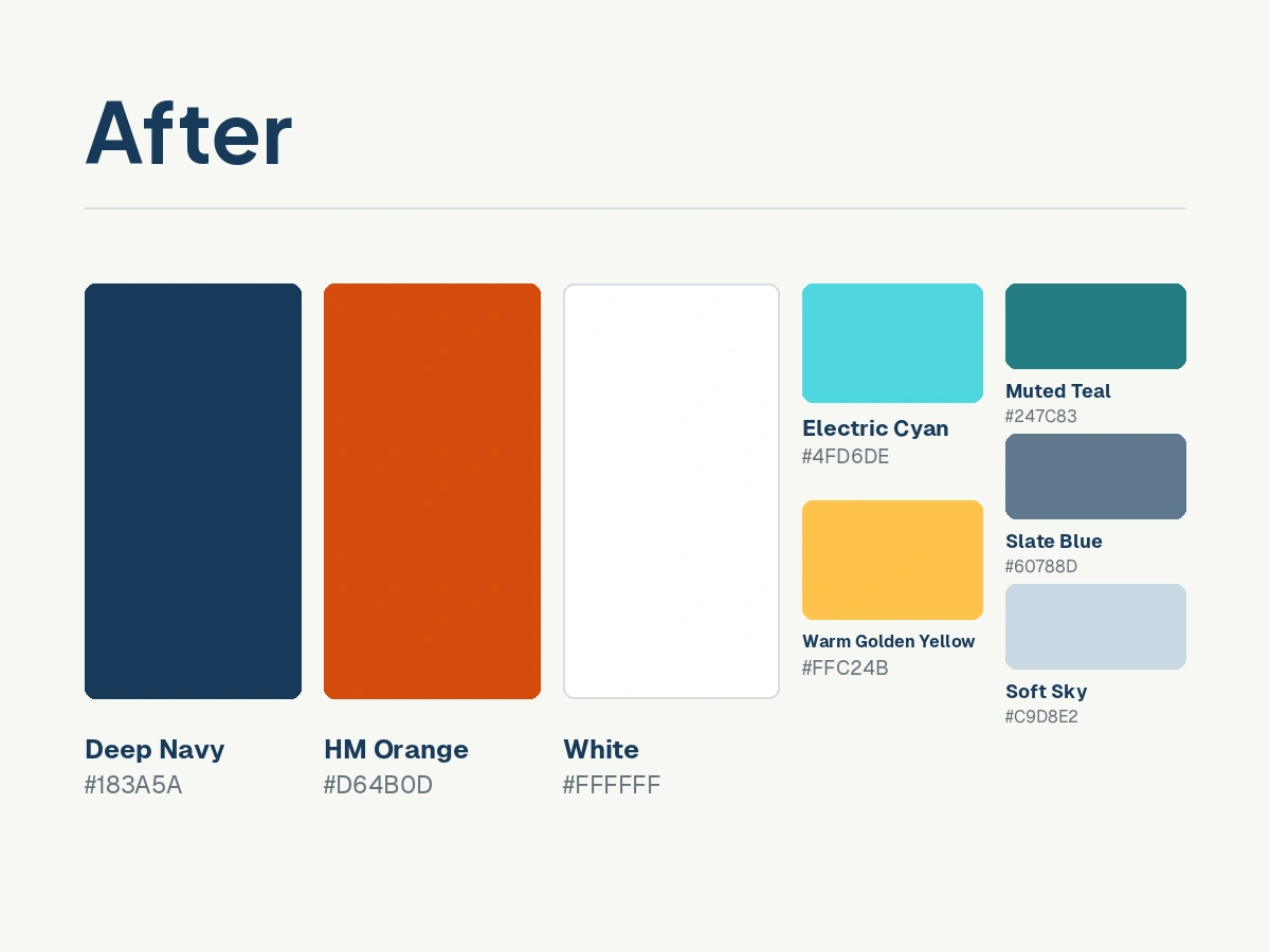
Deep navy is the anchor, & orange is what moves you: buttons, links, the things worth acting on. Around those two sits a wider supporting range, including a vibrant new cyan, and a warm golden yellow, plus a set of neutrals (not pictured below) that keep pages open instead of heavy.
We had felt for a while that we were outgrowing our color palette. When we rebuilt the site in 2025, we changed nearly everything except the palette, and that turned out to be a piece that we were feeling limited by the more the seasons went on. We no longer felt like our old slate represented us, and our orange was carrying too much weight for its own good, plus we weren't huge fans of the accent green we had.
With the new navy and orange combo, plus our new accents, we landed on feel that is modern without feeling like a costume. It's a more current vibe, but still recognizably High Monkey.
The website
Here's what you'll notice when you take a look around the new site:
- Squares instead of soft edges. The rounded corners and wavy dividers are greatly reduced. You will now find straight lines, clear breaks, and a more direct structure throughout. The result is vertically efficient without feeling crowded, which is a harder balance than it sounds.
- Trimmed down almost everywhere. Our headers, sections, and portfolio tiles were all taking up too much room. All three got tightened, so you scroll less to reach what you came for.
- New navigation curtains. They use more horizontal space, breathe better, and feel considerably cleaner than the old ones. We love the way the new images in these complement our new color palette as well!
- A new hero image. It brings a deep, optimistic blue to the top of the site, and it combines better with the content in the hero.
- Blog and podcast moved way up the homepage. Our blog and podcast updates used to live in the depths of our homepage, which is a strange place to bury the things we spend the most effort on. They now sit in a column on the right side of the first section under the hero, where you will actually see it.
- Light trails throughout. Long exposure photography, and abstract layers of digital lines make up our visual theme now. You will find this in our header images, in both navigation curtains, and on the About page, where we redrew our timeline graphic to match the new direction.
- A new type system. We also outgrew our old fonts, so we figured: new era, new fonts!
Put together, the logo, the palette, and the site are all pointing at the same thing. We didn't just want to look different, we wanted to look like a company that's actively moving instead of standing still. That's the position we're in right now: rethinking how we show up, not because we had to, but because we knew where we wanted to be.
If that's a familiar feeling, you're probably going through your own version of it too, whether that's a digital platform that's stopped keeping up with you, or an AI landscape you haven't figured out how to approach yet. That's exactly where we come in.
A reminder about Intentional AI
While we're talking about what's new, Intentional AI belongs on the list too.
Intentional AI is our newest service for helping you figure out where AI actually helps your organization, and where it's just adding noise.
Most organizations we talk to are stuck between two extremes: some are adopting AI tools with no real direction, others haven't started because the landscape feels overwhelming and the stakes feel high. Neither gets anyone anywhere.
Without structure, AI creates noise, & without clarity, it creates risk.
Our approach stays practical. We look at how, or even if, your organization is actually using AI today and give you an honest baseline to work from. From there, we break down your workflows to find where AI creates real value and where it just adds complexity, and you leave with a prioritized plan you can keep evaluating as the tools change.
Small, focused wins are what move the needle for us, not sweeping transformation nobody asked for.
That's not a position we landed on out of nowhere, we've spent real time with real content and workflows, testing tools at each stage of the AI lifecycle and comparing notes as a team along the way.
We actually just wrapped season 3 of our podcast, Discussing Stupid, in June, where we made that thinking public. The finding that stuck with us the most? AI reflects what you bring to it. Strong process knowledge and real domain expertise get results. Gaps and blind spots get amplified.
Learn more about Intentional AI
Listen to the Intentional AI podcast series
And speaking of Discussing Stupid...
Discussing Stupid Season 4 arrives October 6
Season 3 found that most bad AI outcomes trace back to bad decisions that had nothing to do with AI in the first place. Season 4 takes that same instinct and turns it on digital work as a whole, starting with a two-part breakdown of WCAG 2.2. New episodes bi-weekly on Tuesdays.
The teaser is out now: Season 4: The Teaser
Episode 1 drops October 6!
Come find us at M365 Twin Cities
M365 Twin Cities is this Friday, September 18, at Hennepin Technical College in Brooklyn Park. It is free, it runs 8 AM to 4 PM, and we will be there!
Stop by the High Monkey booth and play our raffle game for a chance at Vikings tickets to the October 25 game against the Colts.
Our CEO, Virgil Carroll, presents Copilot and Microsoft Search: Better together at 10:45 AM in room H253. Traditional search or generative search is a false choice, and he will show you why the answer is both.
We would also just like to talk. Tell us where your organization's digital strategy is headed, or where it is stuck. That conversation is the reason we show up to these.
Registration is still open at https://m365tc.com/#Home
Evolve with us
The logo, the colors, and the site all point at the same thing: High Monkey is evolving, and we wanted our brand to say so out loud.
If your organization is going through its own version of that, reach out - we would love to hear about it.
Let's build a digital platform that fits the organization yours is becoming.
Latest Blogs
High Monkey launches a rebrand
.webp)
Inside the new OSA site

MindLab Connect Is Live
Your success story starts here
Contact us for a free consultation, and let’s work together to build a strategic plan that tackles your challenges and lifts your organization to a new level.